How To Filter By Colour In Ecommerce
I’ve had countless discussions over the years with owners and stakeholders about whether they should implement colour swatches on their website.
It seems such a small part of your website – a little square pixel with a block colour – but if you’ve ever built an ecommerce site you know that it is never that simple.
Why Use A Colour Swatch?
According to research, 85% of consumers say colour is the primary reason they buy a product (Source: Color Psychology in Marketing) whilst 90% of impulsive purchases are based on colour alone (Source: InVerve Marketing).
With this in mind, colour is clearly a key ecommerce factor that must be considered carefully on any online store. It’s use-case cannot be underestimated.
By implementing colour swatches, the idea is that we can improve the user experience and ultimately increase conversions.
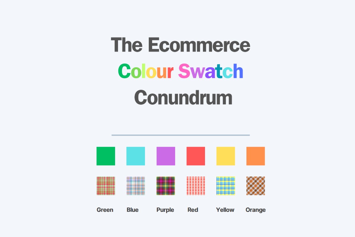
What Is A Colour Swatch?
The colour swatch in particular on an ecommerce website is usually defined by some form of small square or rectangle that denotes the colour of the product. The idea behind it is that it can help with:
- Filtering by colour from a PLP (product listings page)
- Choosing a different variation of the product on your PDP (product detail page)
However if not done with some thought, this can quite easily become a beast that is not easily tamed.
What Are Some Considerations Around Using Colour Swatches?
Some of these you might not have thought of, whilst others you may have wondered how to combat. Hopefully you’ll glean some insight from the points below:
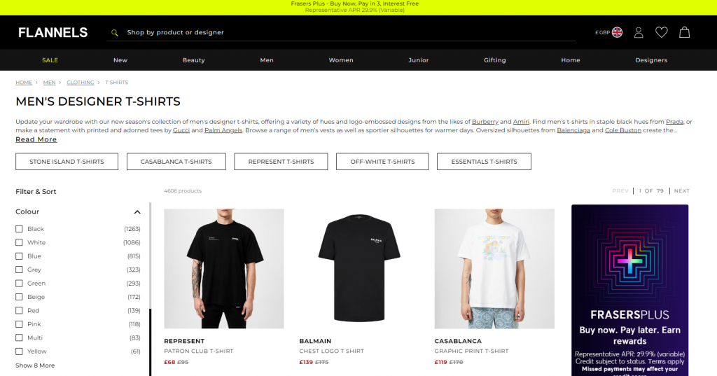
Too Many Colour Options:
This particular screenshot is from womenswear site, although it looks like it could have came right out of one of Damien Hirst’s “Dot” paintings.#
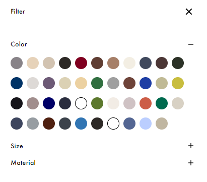
Overwhelming customers with too many colour choices can lead to decision fatigue and potentially abandoned baskets. You must introduce a carefully selected palette that potentially could be suited to the aesthetic of your website. A curated selection not only enhances the aesthetic of the page but also simplifies the buying process for the customer.
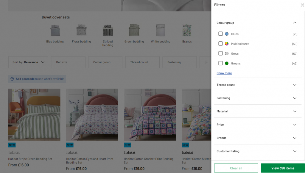
Staying Generic:
Following on from the last point, it may be worthwhile staying very generic with your colour scheme. Options such as Black, White, Green, Yellow may be good enough to group your products. Argos actually class their colour filter as “Colour Grouping” as if to say they acknowledge that it’s not strictly a specific colour.
It then becomes a decision of how far you take this. You may want to have an option for “navy” as well as “blue” and put your darks in the navy option and the lighter blues in the blue section. Sometimes it comes down to the volume of products that you have and how hard that then becomes to navigate for a user.
Consider A Multicoloured Swatch:
Multicoloured products present unique challenges for ecommerce sites when it comes to filtering by colour. To ensure accurate results, consider making your colour attribute a multi-select option in your CMS. Therefore you can either categorise it as “multicoloured” or “patterned” but then also give it a value relating to the hue it most closely resembles. By doing this, you are ensuring that your product is going to be seen by customers who select both options. From a customer perspective, this works for them as it delivers more relative products rather than a poor experience.
Using The Fabric Image As A Swatch:
Using fabric swatches as visual references can provide a more accurate representation of the product’s specific colour and texture. This helps in particular when a garment is available in multiple colours or patterns.
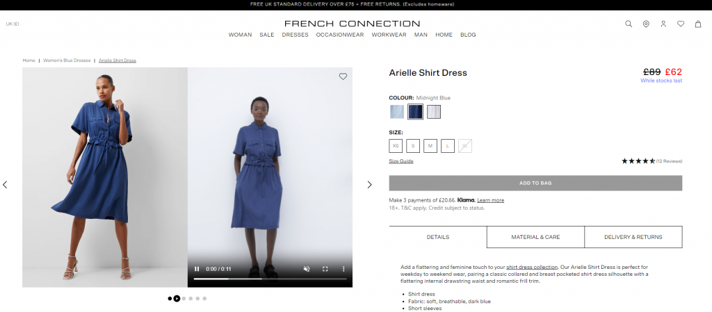
However, it’s important to ensure that the swatches are representative of the product. This normally means having to cut a small area from one of your images of the garment and upload and associate this to the product in your CMS. If you have the resource to do this, it can be a nice way to display the colour in an accurate way.
What I would recommend with this method is to give the product a standard colour value like “blue”. This will help a customer filter the products from the PLP but on the PDP, the image will overlay the colour swatch giving a representation of what the variant looks like.
Using Text Only Swatches:
Text-only colour options can simplify the filtering process without overwhelming your customers with blocks of colour and keep a clean aesthetic to your site. However, they may not provide the visual impact of a block of colour. This in most cases will come down to how you feel you want colour to be represented on your online store.
Review Your Colour Filters On-Site:
Regularly test your colour filters on-site just as your customers would. It is essential for ensuring that they accurately reflect your product offerings and provide a seamless shopping experience. Consider asking friends / family to test your colour swatches to see if they have any issues with it.
Many times manufacturers will supply a product with a specific colour value which is quite blatantly not the best way of filtering it by. It may be “ice-white” on the label but it may feel more like a sky blue. You have to use your judgement and make these calls as you go along. In this instance, there’s nothing wrong with calling it “Ice White in the description but allowing it to filter by blue if that was more appropriate.
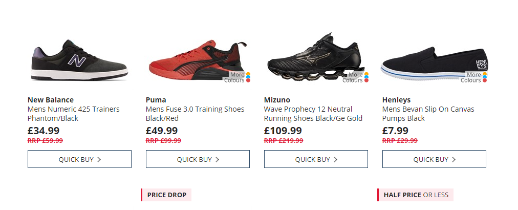
In the example below, I filtered by black but I would argue that the Puma shoe is more red than black. If someone is looking for a red shoe and it only has 1 colour set in the CMS, then this product wouldn’t display.
Think Ahead When Planning For Colour Swatches:
Planning for colour swatches early in the development process can save time and effort in the long run. By establishing a consistent colour naming convention and implementing a bulletproof colour filtering system, you can avoid the need for costly agency revisions and ensure a smooth process.
How Do You Handle Colour Swatches On Variant Products?
Let’s set the scene. You have one product in 5 colours.
“We need a colour swatch on the product page” declares the stakeholders.
Before you dive in, you need to consider how you want to handle the product creation and SEO of that product. Think of these potential issues:
- Do you want one product page that pulls the data into it for the other variants? In effect you’ve then only got one product page to optimise for SEO
- Do you want 5 product pages that each display the other 4 products variant colours? This way you get separate pages to SEO. However it’s more work and you have to ensure all of the products are available to put online at the same time. Otherwise your colour swatches won’t go anywhere for colours that haven’t arrived or been uploaded yet.
You need to discuss options with your developer, ecommerce consultant and warehouse management system to find out which solution works for your business. There’s not a right / wrong answer.
While there isn’t a one-size-fits-all approach to implementing colour swatches on ecommerce websites, I hope that you can now see that careful planning and execution are crucial for success. By understanding these points and establishing a thoughtful colour palette with accurate back-end data, you can enhance the user experience, improve conversions, and keep a nice aesthetic to the store. Regularly reviewing and refining your colour swatch strategy and keeping an eye on evolving trends will ensure that you are offering a great offering for years to come.
If you require any help implementing colour swatches on your ecommerce store or wish to discuss how you can grow your online revenue with an ecommerce consultant, please reach out to me and I’ll be happy to have a chat.